Thursday, 16 January 2014

Environmental Props

To populate the game world I created several small assets, these assets provided visual narrative context to the space.


Despite laws in most places that prohibit smoking in public spaces, the novel was written before these laws came into effect, as such, several characters smoke in public spaces, including the Jarre de Thé


The Yin-yang symbol was added to the booth screens to signify the Asian location of the Jarre de Thé


Even though the novel is set in Japan, Gibson makes frequent reference to signs being depicted in English due to its status as a universally known language in the novel's setting. Similarly the green exit sign is a universally known symbol.


The casing of the self service terminal was designed to evoke the style of computer monitors used in the 80's and 90's, the bright red plastic cover fits into the thematic design of the rest of the game space. The blue screen shows that the terminal is damaged thanks to the poor maintenance found throughout the Ninsei area.


The coffee dispenser was designed following the philosophy that automation will gradually replace human staff in cyberpunk locations.


Following the same design philosophy of the coffee dispenser, however it has suffered internal damage and does not travel about the space cleaning up, leading to dirt being found around the space.


Textures and lighting


After the models had been created, they required textures, otherwise they would simply be grey models. Because of the plastic, mass produced nature of many of the assets and the dark lighting, detailed textures were rendered unnecessary because it would be difficult to see them under the lighting.


A Dark Red transparent material was used for the tables and benches within the space.


The coffee cups were coloured blue to signify their mass produced plastic material.


The green lighting on the central column causes it to stand out from the rest of the game space, marking it as a centrepiece to the room, as well as signifying its prominence.


The Yin-Yang symbols were used to signify the multiculturalism of Cyberpunk fiction, as well as the teashop's location in Japan.


Establishing lighting

In order to light the game space, I needed to experiment with different kinds of lighting in order to develop the correct effect.


I originally experimented with point lights within the space, however I found that I required an excessive amount to create the desired effect, and the lighting was difficult to control.


Because the point lights were largely ineffective, I instead switched to spot lights. Using fewer lights I can create a greater atmospheric effect, making the space feel much more intimate and packed together.


Spotlights also allow for the use of Light Cookies that simulate gobos used in stage lighting. By using cookies you can create an effect of dirty lights or grilles over the bulb, further establishing visual narrative conventions.


Props, theming and scale

After establishing the style of the space I needed to begin modelling assets in Maya. Because of the advanced technologies of a cyberpunk world, the majority of the assets in the space would be constructed on continuous production lines. 


The benches that are provided in the booths are themed around the hexagon shape that is common motif within the space.


This Hexagonal table provided the style that all other assets within the space would be themed around.


For the screens used in the booths, I used a cube that was then curved to better fit into the hexagonal theme without compromising the ability to conceal people sitting at the booths.


To check the scale I used cylinders and cubes that are sized accordingly to the object that they represent. I then used a scene in unity to check the size of the objects against each other to maintain the correct size.

Initial Testing

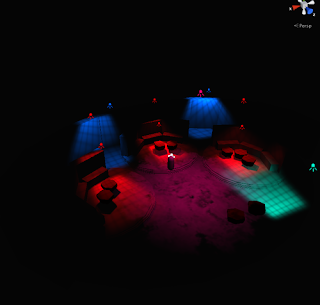
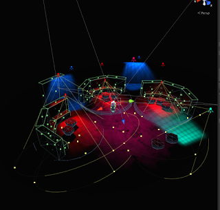
Early in development of my game environment I began experimental with the space and lighting within the environment. These tests were crucial because the allowed me to quickly establish the shape of the space before I began modelling the assets in Maya.


The lighting of the space was primarily informed by a line from the novel, while the hexagonal theme was recurrent throughout the initial sketches.


A test into the size and overall shape of the space, I soon discovered that the space was too large for the claustrophobic conditions of a cyberpunk building so I looked into shrinking the size of the space.


When experimenting with scale I looked into having coffee dispensers or vending machines, although the coffee dispensers in the final game are much smaller than the block I used to test lighting.


This initial blocking out of the bar incorporates the central column theme I had established early on, however I lated replaced it with a smaller column and self serve terminals to better incorporate the futuristic cyberpunk theme.


Wednesday, 15 January 2014

Initial Sketches

Before I began modelling the game environment in 3D, I initially drew some rough sketches to help visualise the thematic appearance of the game space. While I am not confident in my environmental drawing abilities, these rough sketches allowed me to identify visual themes that I wanted to include within the environment.


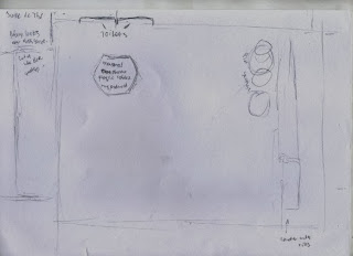
This first sketch featured several rough shapes that were possibilities for the layout of the room that the player would explore.


This initial floor plan was not an identifier of scale or layout of the room, but rather allowed me to figure out what objects would be included within the space.


The central column for the bar in this sketch was used in my final environment however the aesthetic style was changed drastically to a more toned down space. Similarly the catwalks were altered to fit the hexagonal theme that I later began to adopt in my design.


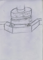
The Hexagonal theme used in the table and benching was kept in the final environment. It also fit with the Octagon shaped pills that the Neuromancer protagonist Case both sells and consumes in the Jarre De Thé


While replaced by self serve terminals, the bar remained as a central column with the game space, however it was drastically simplified due to lighting constraints within the space.


A further exploration of the hexagon there as well as identifying and designing logos mentioned within the novel.


The Beautiful girl coffee logo was inspired by a coffeshop chain in the Neuromancer novel, the character Pris from Blade Runner and a graffiti piece on my moodboards. This piece was never intended to be used directly in the game environment, but served to identify the aesthetics of the location.

Chiba City, Asian Graffiti and Japanese bars Moodboards


For my game environment, I chose to recreate the Jarre de Thé teashop location from the opening chapter of Neuromancer. The teashop is situated in the dangerous Ninsei area of Chiba City in Japan, so in order to identify the aesthetic qualities of the Jarre de Thé, I created moodboards based around the real Chiba City, Asian Graffiti and Japanese bars and restaurants.


The Chiba city of real life shares many aesthetic qualities with cities found in cyberpunk fiction. Chiba is made up of vast cityscapes and tall skyscrapers closely packed together, with many bright neon coloured lights populating the skyline at night. Similarly the city also blends modern and post-modern architecture with the traditional architecture of the Edo era of Japan, and despite the cherry blossom trees and traditional Japanese architecture, has similar aesthetic qualities to many other modern cities found across the globe.


The Asian graffiti featured above has many similar aesthetic qualities to Cyberpunk cities, the artwork features Asian characters rendered in bright neon colours, and traditional Asian folklore images remastered for a unique effect. Because of the public stigma towards graffiti, it can visually represent an urban environment and society that has degraded over time and shows an apathy by the governing class towards the residents of this society.


Due to the Jarre de Thé being located in a Japanese environment, I needed to identify several aesthetic qualities found within Japanese bars, restaurants and cafes. Similar to Cyberpunk fiction, these establishments often make use of red lighting and a blend of modern and traditional styles, such as the Chinese lanterns set against the graffitied walls, or the use of geometric shapes such as cubes and octagons surrounding the bar.

Utopia and Dystopia

Neuromancer, and by extension other cyberpunk works are set in densely populated urban cities. Due to the cramped conditions and lack of regulations and restrictions placed upon technologies and the corporations that sell them in these environments, the residents of these cities often live in poorly maintained and disused areas, or in coffin hotels, firmly identifying cyberpunk cities as dystopian in nature.  In order to develop the look and feel of the game environment I would be creating, I needed to clearly identify the difference between a utopian and dystopian city. In order to do this I created two moodboards, one depicting utopian cities, the other showing dystopian cities.


Utopian cities, although featuring closely-knit urban environments, subvert the claustrophobic nature of cities by featuring large spaces between similarly sized buildings and often feature parks or rivers in order to create a balance between nature and the city. Utopian cities also make use of bright cool colours blended with warm colours in order to show a bright, clean city.


Dystopian cities use the close-knit nature of urban environments in order to create a claustrophobic and unsettling atmosphere, by tightly packing in the buildings together, the human residents are made to feel incredibly small and cramped together, almost everything is artificial within these cities, giving the streets an unnatural, uneasy feel. Dystopian cities also make frequent use of dark, block colours in order to evoke emotions of fear and unease within the unsafe and unregulated city streets.

For my game environment I would need to make use of the dystopian city conventions, creating claustrophobic spaces and utilising dark colours in order to visually represent the poor living conditions of the city.

Neuromancer Moodboard


For the practical element of my project I opted to create a game environment based on the 1984 cyberpunk William Gibson novel Neuromancer. In order to create this game environment I needed to identify the aesthetic qualities of the game space.


In order to identify the aesthetic qualities of the game space, I chose to create several moodboards that highlight several aspects of the space that I would be creating. To start I created a moodboard based on the cyberpunk genre, due to Neuromancer being one of the prominent examples of the genre, laying down many of the conventions and staples that the cyberpunk genre follows.


I have used a variety of sources when creating this moodboard, using real life places that embody the cyberpunk aesthetic as well as speculative concept art. A staple of the cyberpunk aesthetic, as can be seen above, is the use of bright neon lights to highlight the advanced technology of a cyberpunk culture. These lights are contrasted against dark backgrounds and poor weather in order to signify the horrible living conditions that the inhabitants of this fiction are forced to reside in.