Before I began modelling the game environment in 3D, I initially drew some rough sketches to help visualise the thematic appearance of the game space. While I am not confident in my environmental drawing abilities, these rough sketches allowed me to identify visual themes that I wanted to include within the environment.
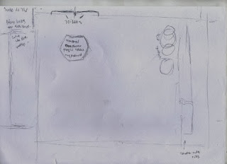
This first sketch featured several rough shapes that were possibilities for the layout of the room that the player would explore.
This initial floor plan was not an identifier of scale or layout of the room, but rather allowed me to figure out what objects would be included within the space.
The central column for the bar in this sketch was used in my final environment however the aesthetic style was changed drastically to a more toned down space. Similarly the catwalks were altered to fit the hexagonal theme that I later began to adopt in my design.
The Hexagonal theme used in the table and benching was kept in the final environment. It also fit with the Octagon shaped pills that the Neuromancer protagonist Case both sells and consumes in the Jarre De Thé
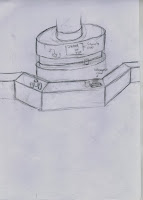
While replaced by self serve terminals, the bar remained as a central column with the game space, however it was drastically simplified due to lighting constraints within the space.
A further exploration of the hexagon there as well as identifying and designing logos mentioned within the novel.
The Beautiful girl coffee logo was inspired by a coffeshop chain in the Neuromancer novel, the character Pris from Blade Runner and a graffiti piece on my moodboards. This piece was never intended to be used directly in the game environment, but served to identify the aesthetics of the location.


No comments:
Post a Comment